Three Reasons Why Dashboarding is Dangerous

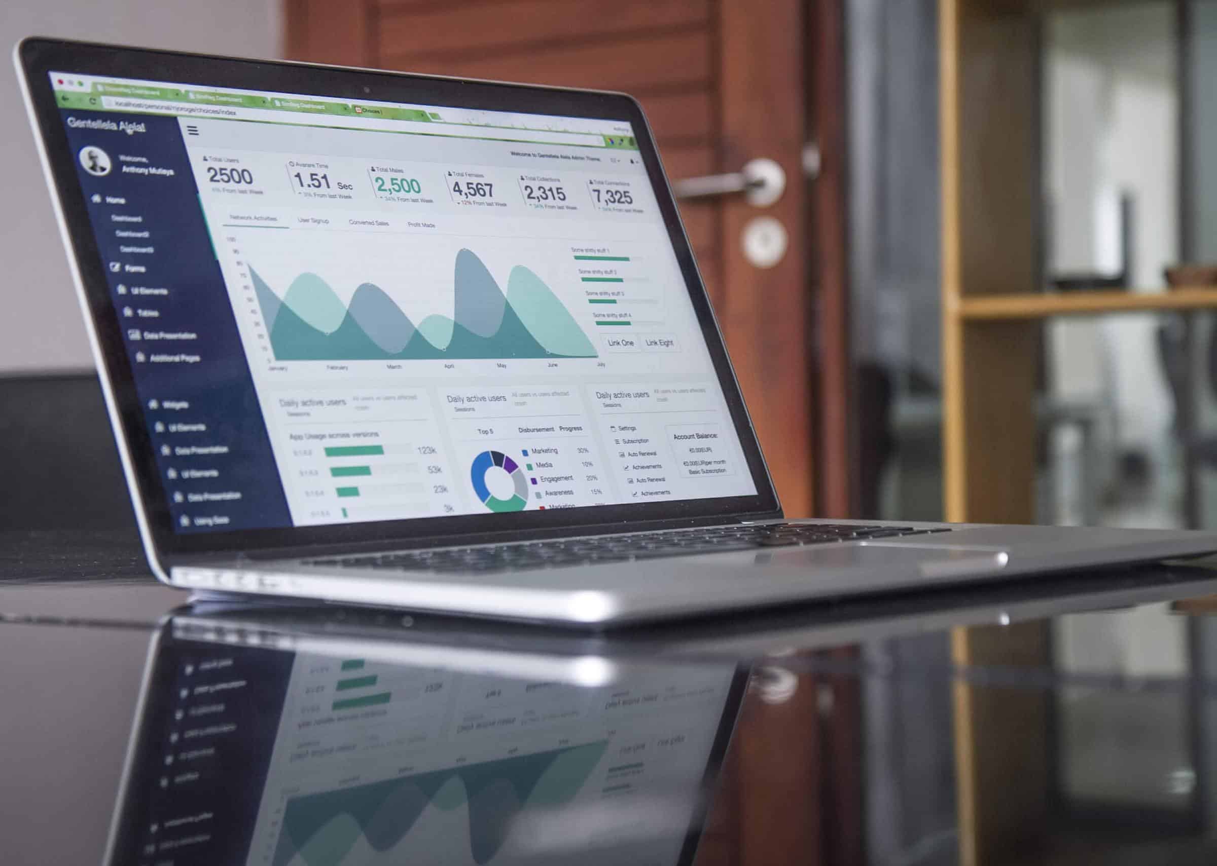
Dashboards have been all the rage for the past 5-10 years as it puts all of your relevant data into one visually-stunning place. That said, just because something looks and sounds pretty, doesn’t mean it’s good for you, your partners, or your company. Rather, clear recommendations stemming from useful pieces of data is the goal when it comes to sharing metrics. It’s crucial to remember that the presentation of data is only as useful as the analytics knowledge of the person viewing said data.
Dashboarding Dangers
Without clear communication or understanding of a dashboard’s analytical meanings, the metrics themselves can quickly lose their relevance and/or accuracy – unfortunately causing more damage than good. Here are a few reasons that dashboarding can not only be misleading, but dangerous for you and your partners:
- Lack of context – When compiling data for your clients, the numbers you’re measuring are more than just numbers: they’re an output of a story; some may be meaningful, some might be meaningless, but without presented context, there’s no telling whether or not something is actually good or bad. In dashboards, this lack of context is often misleading as they only provide visual representation of data. There is no story behind the findings, leaving your clients in a situation to interpret the data themselves. This often leads to overreactions and ill-advised strategic shifts.
- Information overload – Depending on the dashboard in question, the visual design of dashboards alone can be daunting. Not only does the lack of context affect the viewer, but the clutter of information deeply affects the initial perception of a dashboard. This could lead to your partners choosing to not check the dashboards at all as they shut down and push analytics off to the side. The sharing of data is meant to bring your partners deeper into a project, not push them further away.
- Viewer specific – Dashboarding may make sense to you, but your partners may not be as well-versed in analytics as yourself. Thus, it’s unlikely they will be able to decipher and decode the meaning of each segment of the dashboard. As mentioned, the sharing of metrics is only as valuable as the person viewing them, meaning that the relevance of the dashboard lies in the knowledge of the viewer. If you share a dashboard full of colors, percentages, and arrows pointing up and down to your partner who has no prior experience with analytical data or no further understanding of what it all means, the dashboard altogether loses purpose.
Our Suggestion?
Take the time to build reports for your clients. You might be thinking, “Well, isn’t building a report more cumbersome?” Yes. Reports are indeed more manual to create and certainly more hands-on in terms of crafting observations and recommendations, but they also allow you, the trusted partner building the report, to have control to tell the real story behind the data – and leave out the stories that don’t matter.
If numbers are up only one or two percent, a dashboard might present a multitude of green “up” arrows; if they were down only a few percentages, they might appear red. Each color carries a suggestion and specific connotation with it, and the colors alone are typically one of the first things to catch the attention of a viewer. This can lead to the types of overreactions we previously mentioned – becoming more harmful than beneficial.
However, on a report you have the opportunity to highlight these changes, and then immediately inform you partners that the changes are minimal and not to be overthought. On the flip side, there might be data that, upon analysis, present very real and important findings. Building a report also allows you to personalize each presentation to that specific set of data – thus calling out items that truly carry significance. It shows you care to help educate them beyond simply providing the scope of work expected of you. And it certainly helps you as you’ve now truly analyzed the data – informing your own thoughts as well.
Key Takeaways
Dashboarding may visually wow your clients, but without clarity, dashboards can be a dangerous display. However, if you build personalized reports, your discoveries can be communicated more effectively to your clients – readily and concisely reporting things that directly affect strategy in a positive way.


