Keeping the User Journey in Mind with Website Design

One of the most important aspects of website design is taking into account how the user will navigate around your site. This includes navigation within a page, navigation from page to page, and navigation between your site and outside links.
It’s a delicate balance — on the one hand, you want your design to nudge users in certain directions. On the other, you want your design to fit the directions your users are already inclined to go.
Information Architecture
One of the most important aspects of website design is taking into account how the user will navigate around your site. This includes navigation within a page, navigation from page to page, and navigation between your site and outside links.
It’s a delicate balance — on the one hand, you want your design to nudge users in certain directions. On the other, you want your design to fit the directions your users are already inclined to go.
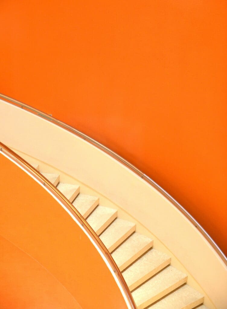
The underlying principle behind these habits is called “information architecture” — the way that you organize information in order to make it easier to find, understand, and use. Organizing a library shelf in alphabetical order is a very primitive (but let’s face it – effective!) form of information architecture, for example. The Dewey Decimal System is more sophisticated.
When it comes to websites, an information architect might conduct interviews or card sorting to find out what makes the most sense to users and then employ those strategies to set up menu structures and page layouts.
You probably don’t have the time or means to do your own original information architecture research, but don’t worry: that’s why you came to the professionals. Years of research, case studies, and usage data have given us a set of best practices that we use to build and customize websites, so you don’t have to start from a blank slate.
Global Navigation
Navigation is the key to usability. It doesn’t matter how many books are in that library if you can’t find the one you want, and it doesn’t matter how useful your site is if users can’t find the information they need to answer their questions or solve their problems. The navigation on your website should revolve around simplicity, clarity, and consistency.
Simplicity means that the path from one page to another should be short and straightforward. In the past, designers employed the “three clicks rule” — it shouldn’t take more than three clicks to get from one page to the next. Given the complexity of information on some modern websites (Amazon, for example), that’s not always plausible. But the idea is sound — don’t make it any more difficult to find information than it has to be.
Clarity means that your navigation should be self-evident. Links should look like links, buttons should look like buttons, and menu items should go where they say they go. Your users shouldn’t have to guess which menu to use or which link to click on to find what they need.
Consistency plays into clarity. Part of making your navigation options obvious to your user is making sure that they always look the same. If clicking on the logo in the upper left corner takes you to the homepage from one page, it should do that from every page. Buttons should be styled the same. Menus should be persistent. It’s all about making sure that your users know what to do intuitively, without guesswork.
Finally, don’t forget about the “back” button. After the URL field, the “back” button is probably the most clicked thing in any browser, and users have expectations about how it’ll behave. Don’t make the “back” button take them back to the top of the previous page if you can help it. They’ll just have to scroll through content they’ve already seen, and they’ll get frustrated.
Breadcrumb Navigation
Breadcrumbs are a string of links, usually between the header and content on a page, that add context to the page a user is currently viewing. Breadcrumbs are a secondary navigation method — while they should be clickable, the goal is to show the user the hierarchy of the page they’re on within the site, not to guide them. If your users are using your breadcrumbs as the main way of getting around the site, you probably need to revisit the breadcrumbs, the menus, or both.
Another thing worth mentioning: don’t use slashes to separate levels of a string of breadcrumbs unless you’re absolutely sure that your product categories don’t have slashes in them. Instead, use a greater-than sign, right-pointing arrow, or some other graphical separator. The idea is to make sure that the separator is visually distinct from the category name itself — as long as you’re accomplishing that, you can use your imagination.
On-Site Search
In today’s world, you can’t get away with not having a search function on your website. Even if you’re not a retailer, some visitors will come to your website with the intention of finding a particular service, article, or resource, and you need to give them a way to find it.
Put the search box at the top of the page where users expect to find it — the upper right corner is best. Don’t try to be too cute with search boxes that only appear when you hover over them. Users looking to use your search function want to type in a query and hit enter, and that’s it. Search boxes have become pretty standardized over the years, so an obvious text box with a magnifying glass logo is fine.
The more content-rich your site is, the more prominent the search bar should be. Put it on every page — customers who are browsing a content-rich site and can’t find what they need will resort to search, and they need to be able to find it from anywhere. Don’t make the bar too small. Nielsen Norman Group recommends that your search bar should hold at least 27 characters, which would accommodate 90% of searches.
Finally, remember that you can adapt these practices over time based on usage data. If customers aren’t using long search queries, you can make the box smaller. If customers are using your breadcrumbs a lot, you might rethink your menu navigation. The beauty of a website is that it’s fluid — if something isn’t working, you can change it.
Designing for the Journey
Beyond aesthetics, the user journey is about choreographing an experience that effortlessly leads users through your digital realm. Think of it as the art of “information architecture,” an orchestra of organization and accessibility.
Navigation is the linchpin of usability. Keep it simple, clear, and consistent — the shortest path between pages, elements that look as they should, and menus that are always where they’re expected to be. Don’t underestimate the power of the “back” button, and let navigation tools and a robust search function be your guiding lights. In this ever-evolving digital landscape, adaptability based on real-time data ensures your website maintains its user-friendly charm. So, as you embark on your web design journey, remember: it’s not just about aesthetics but the symphony of user-centricity that genuinely defines your digital presence.
